Friday, 25 April 2014

Colour Concepts


I've been playing around with my letraset graphic pens, which I had kind of forgotten about these last two years, to create some colour concept work for my animation. It's great using them because I have a nice variety of colours, many of which are bright and bold, which is what I want my animation to be! Something that catches the eye and retains it for the short amount of time.

I like the idea of blending yellows and lilacs together for the rhino, as I can then turn this into lilac, pinks and oranges, or whatever other combo for the unicorns.
My next aim is to play around with acrylic paints for smoother and more intense blending, like Gerhard Richter.

Drawing studies.


Some studies to help me visualise and get a clearer idea of the movement of these animals. (The idea of animating still baffles me. I am finding it a bit hard and quite daunting still. I fear it won't be a very long animation due to my lack of patience.)

I am have been quite rubbish and lazy with scanning my own work into the computer so there will now be a string of posts with various drawings and illustrations regarding my work process so far with my project. Enjoy-

General Inspo


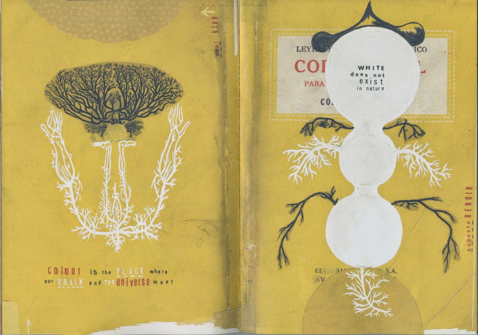
I am fascinated with the work of Sara Fanelli. I would love for my sketch book to look like her book "Sometimes I think, sometimes I am". But that's probably why I am so fascinated with her work, because it's not something I do, or how I work. I am a big fan of the quotes and illustration combination though, and have started to experiment and cut out bits and pieces for my personal use/diary/journal type book. In regards to my current project, her use of bright and contrasting colours and and compositions attract me, which I can hopefully achieve in my own work. I also hope to achieve a similar effect with layer and collage to keep a analogue feel to my animation, even though I will be creating the line and base work digitally.

Viewers Perception


After one of the tutorials I have had with my tutors, one of things I noticed on my tutorial sheet is from what perspective will the animation be viewed. I hadn't thought much about this, only seeing it as a third person perspective, similar to that of Toy Story. It also highlights my idea of a secret world, as the toys only come to life when there is no human presence, similar to the morphing of rhinos into unicorns. However I want to keep an element of realism in my animation as well. This bought me back to the idea of viewing it almost as a documentary. In the BBC's Africa, they use camera traps to capture the rhinos behaviour at night, and I feel this could work for mine too. It creates the illusion of spying on something, and discovering something new - like a secret world.


Children's Books as Inspiration

I've always been a big fan of fully illustrated pages, bursting with colour. For my last project I wrote and illustrated my own children's book. It had all double page spreads which were completely covered in art. I find it attractive, eye catching and immersing, particularly for the younger audience. So I am going to keep this animation along the same lines, full of colour that the viewer can immerse themselves in when watching it. This bodes particularly well with themes of fantasy, as I can really explore colour combinations and create something that pushes the boundaries.
This is the work of Mathew Robertson. He combines hand rendered, collaged and digital work to create these wonderfully appealing illustrations for children’s books. I hope to use a similar style, combining digital line and base drawings with hand rendered textures and washes, which can be scanned in and used in the background and for the characters.
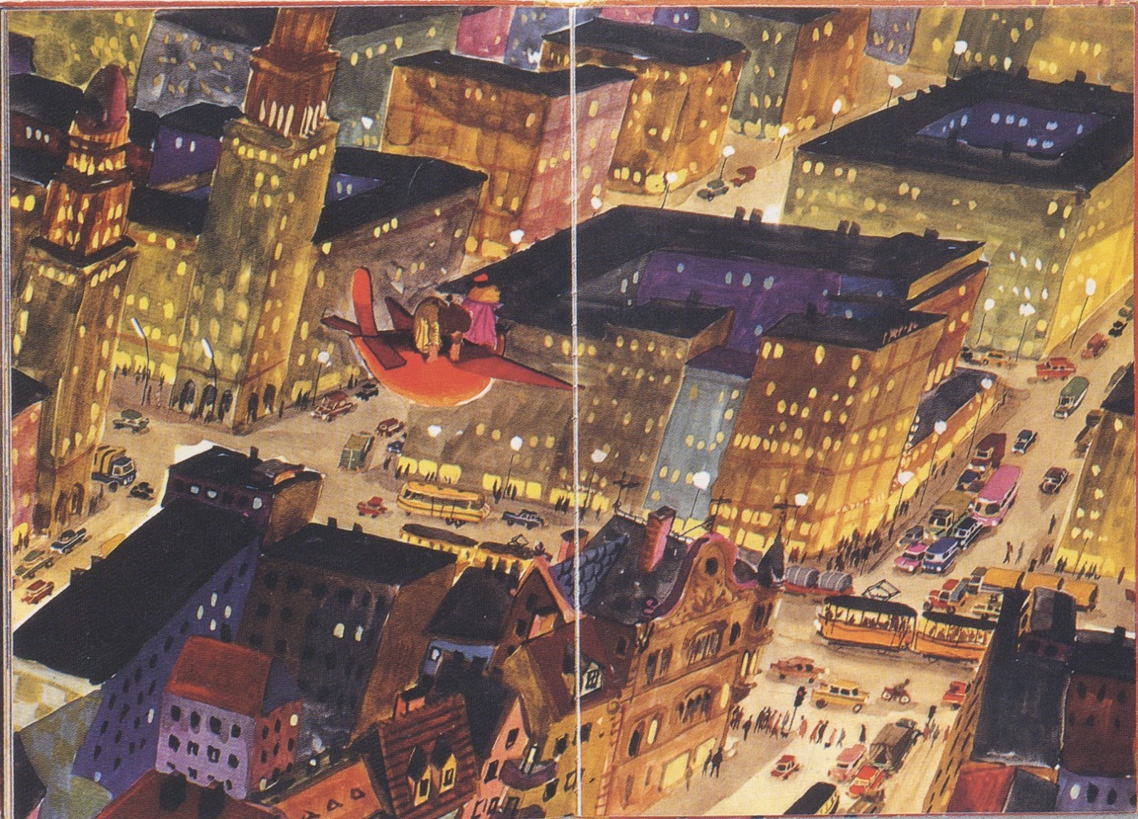
This illustration is from the children’s book Mr Clockman, illustrated by Eberhard Binder. This particular double page spread is full of life and colour, engaging with the audience and bringing them into the narrative. Books that are “created with integrity, both artistically and in relation to the needs of the child, can lead to picture books that will continue to enchant through the generations.”[1]

[1] Salisbury, M. (2004). Illustrating Children’s Books, creating pictures for publication. London. Quarto Publishing.


Wednesday, 23 April 2014

Think Bright!

I'm having some ideas about my colour scheme for my animation, and I'm thinking bold bright colours! It is only a short animation and so I want it to pop, stand out and draw my audience into watching it. The idea of fantasy, with there being unicorns, means I can play around with textures and create something that balances reality with fiction.

I have always been a fan of Gerhard Richter's work. He uses collage to blend colours, which in turn create patterns and textures to create abstract pieces of art. I plan to experiment with this style to use as backgrounds and skins for my characters.


Animations from old National Geographic magazines.


"Art, I believe, is articulated proof of otherworldly exploration – being able to share the unobservable. The methodology of scientist and artist are one and the same; they just have different subjects of fascination."
- Nathaniel Whitcomb


Courtesy of Dazed magazine, this article shows the fascinating work of Nathaniel Whitcomb who uses old National Geographic magazines and creates animations. I am going slightly off topic of my work with this post, but I find his work quite fascinating, as I have a particular interest in National Geographic myself. It appeals to my idea of exploring the 'unobservable' in nature.